
The purpose of data visualization is to facilitate the perception of information arrays and to identify patterns that are difficult to notice in a text table. To make a useful and powerful infographic, you need to follow the laws and regulations of data visualization. Some violate these laws and use subtle distortions to manipulate users’ perceptions. In this article, we’ll look at how data visualization can mislead users.
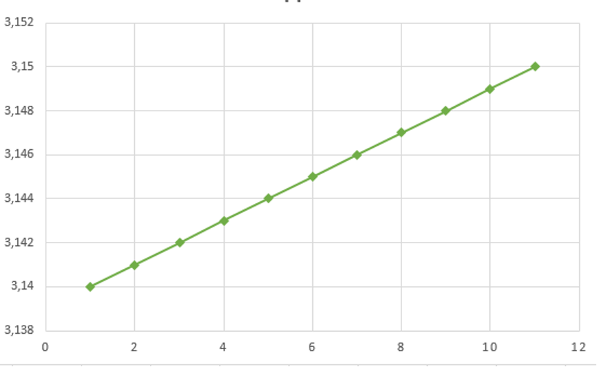
Changing Y-Axis Minimum Values
Purpose: To visually exaggerate the scale of the change.
The larger the minimum value on the Y-axis, the more scaled the graph looks. For example, in the chart, the “interest rate” is considered in the range from 3.14% to 3.15%. Such a presentation gives the impression of rapid growth. If you show the data on a graph with a Y scale divided by units, the picture will become much calmer and more truthful.
In life, examples of such visualization manipulation are quite common.
Data Inconsistency with the Scale of the Illustration
Purpose: To manipulate visibility.
If you use the sizes of figures to visually compare two values, you need to take into account the ratio of their area. If, for example, the height or width of a shape is used instead of an area, this distorts the data. The example below compares three squares: although the last number is only 3 times larger than the first, the area of the last square is almost 9 times larger than the first, and this is because the comparison uses the height of the square, not the area.

Using 3D charts and Illustrations
Purpose: To visually increase or decrease the required values.
Sample Manipulation
Purpose: To present only the positive part of the trend.
An example of a game with histograms: in a short time slice (orange), it seems that the graph is growing, but if you increase the time period (blue), in the context of general dynamics, the growth will turn out to be insignificant.

Violation of Generally Accepted Norms
Purpose: To confuse users.
Another common trick is to not follow established rules and regulations for presenting information. For example, everyone is used to the idea that pie charts are used to represent parts of a whole, or that timelines with progress move from left to right. Therefore, when such rules are violated, it is difficult for people to navigate, and they may not understand what exactly they are being shown, having incorrectly interpreted the presented data.
For example, Fox Chicago showed this pie chart to its viewers during the 2012 presidential campaign primaries:
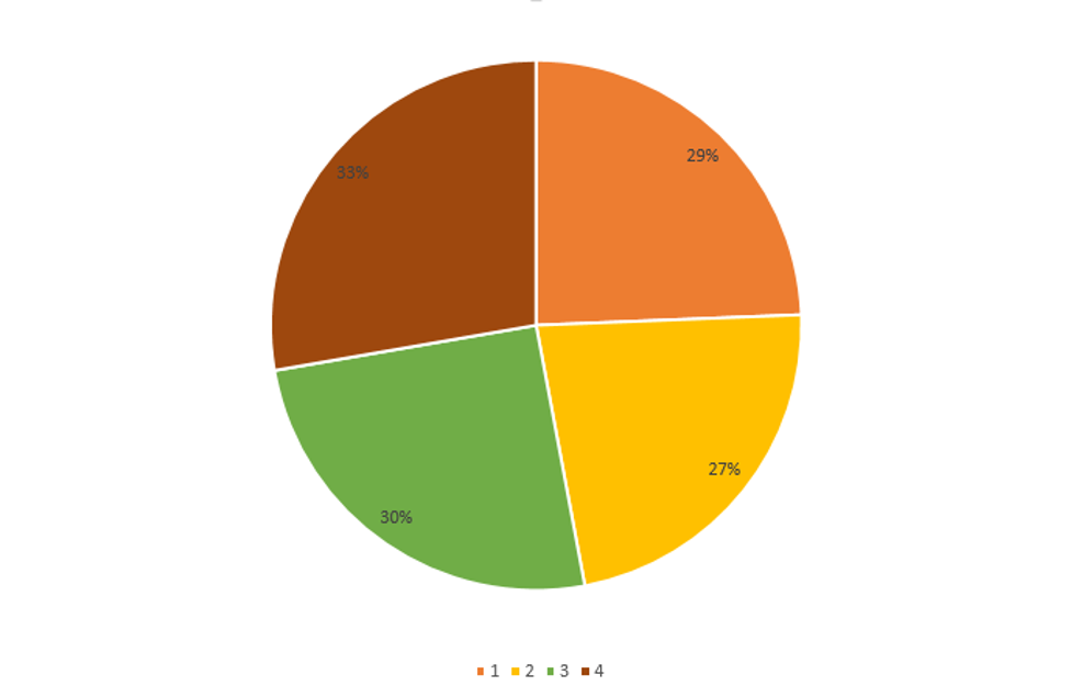
Obviously, if you add up the percentages of all candidates, you get more than 100% – all due to the fact that the graph illustrates the results of a survey with a choice of multiple answers. Accordingly, in this situation it would be much more appropriate to use a chart displaying data in the form of bars. But this was not done, and as a result, it seems that each candidate is supported by about a third of the voters, which is actually not the case.
Representation of Dependencies Between Incomparable Quantities
Purpose: To manipulate visibility.
Another method of graphic manipulation, we consider the presentation on the chart of two scales at the same time. Usually this leads to the fact that incomparable things are compared. For example, you cannot compare which is more – 30 pounds or 12 miles. In this case, a comparison is made of incomparable things, albeit from the same area.

This graph shows two relationships: the unemployment rate as a percentage (on the left axis) and the number of visitors to the local club. When looking at this graph, it may seem that the number of club visitors has exceeded the number of unemployed, but this is not the case. It is generally impossible to draw conclusions from this illustration. Typically, journalists or scientists make this mistake by simply trying to present as much data as possible on a single graph.
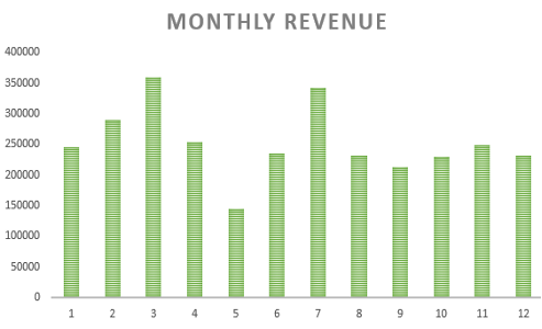
Mid-Truncated Column Representation
Purpose: To visually exaggerate the scale of the change.
The diagram shows just such a manipulation technique. It is quite obvious that, even though the axis starts at 0, such a chart is not indicative, since the columns are truncated and the difference between values is unnecessarily dramatized. In this example, for simplicity, an exaggerated case is shown where the intervention is visible with the naked eye. However, if you truncate the columns in the middle and do not include the axis labels, then such a chart may look believable.
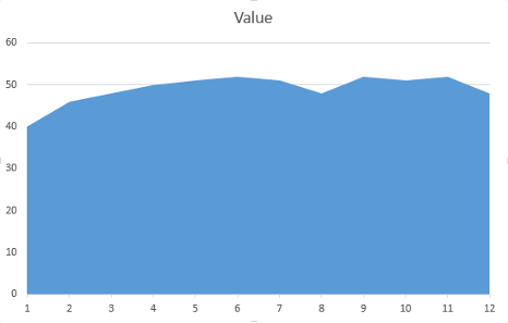
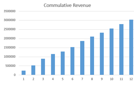
Cumulative Graphs
Purpose: To visually exaggerate the scale of the change.
You can often find graphs that provide some general information on important metrics, such as number of users, revenue, downloads, etc. For example, instead of displaying a graph of quarterly revenue, you can show the total revenue that was generated by a specific date.
It might look something like this:
It is difficult to understand the real state of affairs from such a graph, but it seems that everything should be fine – the numbers are growing. However, if you look at the “non-cumulative” graph that shows the amount of money earned in specific years, the situation looks far from optimistic.
Everything is much clearer here: revenue has been falling over the past ten years! Of course, you can understand this simply by examining the cumulative graph in more detail, but in this case, there is no such immediate clarity with the state of affairs. Such graphs confuse the viewer.
A fairly large number of cumulative graphs can be cited that present the situation in a much more favorable light than it deserves.
Data visualization is a tool that can easily mislead untrained users. Therefore, it is important to critically look at the various charts and not believe right away. The manipulation techniques that we have listed are far from the only ones; in fact, there are many more of them.
