To quote a classic movie, Network, “I am as mad as hell and I am not going to take this anymore!” I am wondering if you are too. The news seems to be discouraging, or at least that’s what the cable news programs want you to believe. And when it comes down to it, there is actually not much good news to talk about.
Maybe I am just mad about how the news is being reported. Okay, that’s it. I am mad about the manner of which the press is reporting data associated with the news. Sensationalism has become commonplace and it does not just have to do with the present pandemic. But that is a big part of it.
The issue at hand is how data is being reported … and not being reported. The whole pandemic situation has made me realize, even more than before, that data can almost always be altered to suit the narrative of the reporter. If the reporter wants to sell you something, they will report the data so that you believe that “four out of five doctors recommend” that you use their product. In regard to the current virus, cases are “dramatically on the rise” when in reality, the rate of infection has reached a pinnacle and has begun to fall. I am not saying that either of these statements are incorrect and I guess in many ways they are true. However, they tell an incomplete truth, a far cry from the complete story.
In case you did not know, there are a lot of books on the subjects of lies and statistics. The books, Everybody Lies, Damn Lies and Statistics, How to Lie with Statistics and (my favorite title) Lies, Damned Lies and Statistics: How Obsolete Stats, Hidebound Thinking, and Human Bias Create College Football Controversies are just a few examples of the many books that will help you to get data to tell the story you want it to tell. College football? Really? Is nothing sacred?
I have written before in TDAN.com that “There are No Facts … Without Data” and that “The Antidote is Facts” so you may already know my opinion on “alternate facts” or data that is “reported” as facts. My business’ focus is on data governance (Non-Invasive Data Governance, to be precise). I state as fact the concept that “the data will not govern itself”. Now I want to take that a step further by stating that the definition, production and usage of data will not happen on its own. There has to be a deliberate attempt to formally govern the data. That means that everybody must be held formally accountable for their relationship to the data. I want to focus here on data usage.
While data is necessary to support facts, many untruths can also be biproducts of how people use data. In 2012, Fast Company, a magazine focused on technology and business, published an article Seven Ways to Lie with Statistics and Get Away With It where they stated the common ways to spread untruths:
- Biased Sampling – This involves polling a non-representative group.
- Small Sample Sizes – Sweeping statements, becomes suspect when the sample size is very small.
- Poorly-Chosen Averages – Averaging values across non-uniform populations.
- Results Falling With Standard Error – A survey can only be as accurate as its standard error.
- Using Graphs to Create an Impression – Graphing data creatively provides a lot of room for creating false impressions.
- The “Semi-Attached Figure” – This means stating one thing as a proof for something else.
- “Post-Hoc Fallacy” – Incorrectly asserting that there is a direct correlation between two findings.
One example of data being reported in such a manner dates back to a finding in The National Review Magazine in 2015 (and reported in the Washington Post). It demonstrated in a chart that there had been only a minor increase in the average global temperature over a 235 year period (1880-2015). Climate change has been presented as a hoax by several publications that want people to believe that the minimal changes in the temperature of our planet are not having any impact on life as we know it.
However, data from numerous other sources demonstrates that the slightest rise in temperature can cause the flooding of coastal cities, loss of the world’s glaciers, extinction of marine life, etc. The list of impact that climate change is having on our life on earth is endless. The data can be downplayed as a tiny change while the impact of this action can be devastating. That is the truth in the data.
Another example that is twisting my socks right now is the way news stations are reporting the number of cases of the coronavirus. The numbers are going up and are going up very quickly. This fact is devastating. My heart goes out to the family and friends of people who have passed away from the virus and to those who are battling it. Health care and essential service workers deserve recognition, gratitude, and kindness for the work that is being done for the betterment and safety of the public, not only during our time of struggle but after. It is a fact the number of people that are being reported positive with the coronavirus is high and getting higher.
The statistic that is not being coupled with that fact, and that is not being reported as often, is the number of people being tested. Most people expected that the number of cases would increase dramatically when the number of people being tested increase as well. And that was exactly what happened.
So when it is reported that the number of cases has doubled – that is bad – but what is missing is what is not reported. What is not being reported turns this data into information that is more digestible, and perhaps, less sensational – and is frankly – less terrifying to the average listener. A statistic that would be much more meaningful is the percentage of people that have been tested – who have tested positive. If the percentage of people who have tested positive increases, that signals that more people being tested are sick, and the percentage of people being tested is increasing. This statistic is telling. This tells us that we need to test more people to see a realistic number of positive cases we can expect. This statistic provides a better for model for planning and preparing for the increased numbers.
I have never been tested. I have not demonstrated any symptoms. I am lucky – thus far. My thoughts are that the number of people not tested should be reported as well.
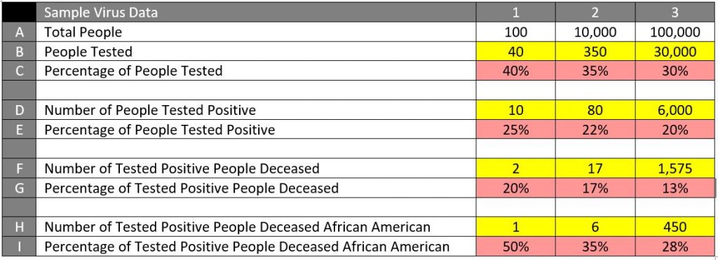
For example: * These numbers are entirely fictional with percentages being approximate.
When we look at the numbers in the B row – we see that the number of people being tested is increasing and that is good. However, when we look at the C row – we see that the percentage of total people is decreasing and that is not as good.
When we look at the D row – we see that the number of people testing positive is increasing and that is bad. However, when we look at the E row, we see that the percentage of people being tested positive is decreasing and that is good.
When we look at Row F – we see that the number of people that have died from the virus is growing rapidly and that is obviously not good. But when we look at the data in the G row – we see that the percentage of people that are testing positive and that are dying is decreasing and that is more encouraging.
When we look at Row H – we see that the number of African Americans that have tested positive and that have died from the virus is increasing and, again, that information is terrible and frightening to that (and all) segment(s) of the population. However, when we look at Row I, we see that the percentage of people in that segment that are dying is decreasing, and even though that information is still terrible (as with anybody dying from the virus), this number may be more encouraging for the people in that segment.
Simply stated, by adding the percentages to the table above you can see that the statistics provide a more telling story. The news is not great by any stretch, but this data gives the public (and potentially the news outlets) more accurate information to report.
There is significantly more to this story. The purpose of this brief article was to demonstrate that the person or people who report the statistics have control over the messaging that is being received by their report. Whether someone is trying to sell you something with only a sliver of the information, a news station sensationalizing a story by providing you with an incomplete story that will keep you tuned in for more information, or a statistic being reported in such a way to minimize the true impact that even a minuscule change in data represents, we are all consumers of the data. More importantly, we are potential victims of how the data is being presented to sway us.
It is imperative to be smart and to continue to demand truth in data. “Buyer beware” or “Caveat Emptor” is an expression used as a disclaimer of warranties. It arose from the fact that buyers typically have less information than the seller about the good or service they are purchasing. Truth in data comes to people who seek out “the rest of the story”.

